
Capstone Website Redesign

DSA Website Redesign

TheSprinters — Akhil, Neil, Moiz

A comprehensive redesign proposal for the Deputy Sheriffs' Association of San Diego County website — improving member experience through an interactive dashboard, modernized FAQ, and enhanced navigation.

About the Organization

The Deputy Sheriffs' Association of San Diego County (DSA) is the labor union representing the dedicated officers of the San Diego Sheriff's Department. With 70 years of service and over 4,229 members, the DSA provides essential benefits, organizes events, and advocates for deputies of all ranks.

As the collective bargaining unit, the DSA negotiates contracts, provides legal defense, supports political action, and offers member benefits and wellness programs. Their website serves as the primary digital hub for member resources, news, the DSA store, and community engagement.
📍 13881 Danielson Street, Poway, CA 92064 📞 (858) 486-9009 📧 info@dsasd.org
Visit DSA Website ↗
DSA Interactive Member Dashboard - Consolidated Resource Hub
View Details
Main Feature
Work Split Akhil — Backend & API Neil — UI/UX & Frontend Moiz — Calendar & Notifications

Interactive Member Dashboard

One Dashboard. Every Resource. Zero Clicks Wasted.

✓ Quick-access tiles for benefits, forms, events, and store
✓ Live filterable news feed with newsletters, minutes, and announcements
✓ Upcoming events calendar with RSVP functionality
✓ Searchable document center with categorized downloads
✓ Personalized notifications for new releases and updates
✓ Mobile-responsive design for on-the-go access
WordPress REST API React Dashboard UI Authentication Integration Calendar Widget Fuzzy Search (Fuse.js) Push Notifications

About

Currently, DSA members navigate through 9+ menu items and multiple pages to find benefits, forms, meeting minutes, and event tickets. The Latest News section only shows 2 static cards. This dashboard consolidates everything into a single personalized hub — quick-access tiles, filterable news, events calendar, and document center — reducing the average user journey from 4 pages to 1 click.

Impact
Members find resources in 1 click vs. navigating 3-4 pages
Increased engagement with news, events, and benefits
Reduced support inquiries through self-service design
Modern professional look reflecting DSA's prestige
Mobile-first ensures 50%+ of users on phones have great UX
Learn More
DSA Modernized FAQ with Smart Search and Live Chat
View Details
Small Feature
Work Split Neil — Content Audit Moiz — Frontend Search & UI Akhil — Live Chat Widget

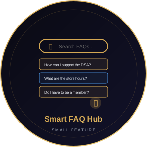
Smart FAQ Hub

Find Answers Instantly — Or Chat With Us

✓ Instant fuzzy search filtering questions as user types
✓ Categorized sections: Membership, Benefits, Store, Events, Legal
✓ Rich expandable answers with links and embedded forms
✓ Live chat fallback button for unanswered questions
✓ Category icons for visual browsing
Fuse.js Fuzzy Search CSS Animations Live Chat Widget Content Management

About

The current FAQ has 5 static accordion questions with no search, no categories, and no way to ask new questions. The Smart FAQ Hub adds instant fuzzy search via Fuse.js, organized categories with icons, rich formatting in answers, and a 'Didn't find your answer?' live chat button that routes to support email or chatbot.

Impact
Instant answers via search vs. scanning all questions
Categorized browsing for different member needs
Live chat ensures no question goes unanswered
Richer formatting with embedded links and forms
Learn More
DSA Enhanced Navigation with Mega Menu and Mobile Optimization
View Details
Small Feature
Work Split Moiz — Information Architecture & Design Akhil — Responsive Frontend Build Neil — Search & Accessibility

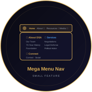
Mega Menu Navigation

Every Page Visible at a Glance

✓ Grouped sub-navigation panels with descriptions and icons
✓ Prominent search bar with autocomplete suggestions
✓ Mobile-first hamburger menu with full-screen slide-out
✓ Sticky header that compresses on scroll
✓ WCAG 2.1 AA keyboard navigation compliance
CSS Grid Mega Menu Autocomplete Search Mobile Slide-Out Panel Sticky Header JS WCAG 2.1 AA

About

The current nav bar has 9+ top-level items with basic hover dropdowns that are hard to use on mobile. The mega menu shows all sub-pages at a glance with grouped panels, icons, and descriptions. A prominent search with autocomplete replaces the tiny icon. Mobile users get a full-screen slide-out with large touch targets.

Impact

All sub-pages visible without hunting through dropdowns
Mobile users navigate the full site with ease
Search autocomplete finds exactly what members need
Sticky header keeps navigation always accessible
Meets modern accessibility standards
Learn More

Team Work Distribution

Every member rotates across different responsibilities — backend, frontend, design, content, and testing — ensuring well-rounded experience.

Akhil
Backend & API Live Chat Widget Responsive Frontend
Neil
UI/UX Design Content Audit Search & A11y
Moiz
Calendar & Notifications Frontend Search IA & Design